
Bose shows a great example of movement in their site. All of the sections make use of the rule of thirds, commonly used in photography. They have a large element within the photograph that is off to one side, and next to that element is text that goes beside the product in the image. The viewer’s eye clearly moves from one side of the screen to the other. They also show all their main products for sale evenly spaced and sized, which draws the viewer’s eye across the screen to view all that Bose has to offer. Bose

The Noodles and Company website makes significant use of pattern, which is a large part of their branding already. They use multiple types of pattern, from small doodles on their images to make it more appealing to the eye, to a subtle patterned background behind some of the other text and images that adds the perfect amount of character. Since the pattern mostly fades into the background, it doesn’t take away from the actual information but still breaks up the page to help with the flow of the website itself. Noodles & Company

Simplicity is one of my favorite concepts, because it is very close to my own style of designing. I try to make the most simple designs that still look visually appealing. A website I found that shows simplicity is the tinker watches site. It is very minimal in it’s design, with few words and large pictures of their product. It creates a luxurious feel and makes the viewer look at exactly what they should be seeing. Simplicity is effective within design because it doesn't overwhelm the viewer. Tinker Watches
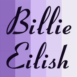
As for unity, I think that as unusual as the example may be, Billie Eilish’s website is a very clear example of unity. The colors, fonts, and graphics are all geared towards looking like her new album that she is working hard to promote. Everything on the site all follows the same flow, color scheme, and font to create a brand that can be identified as her own. This is important in unity, because there has to be balance between making everything look the same and still making it interesting to look at. Billie Eilish