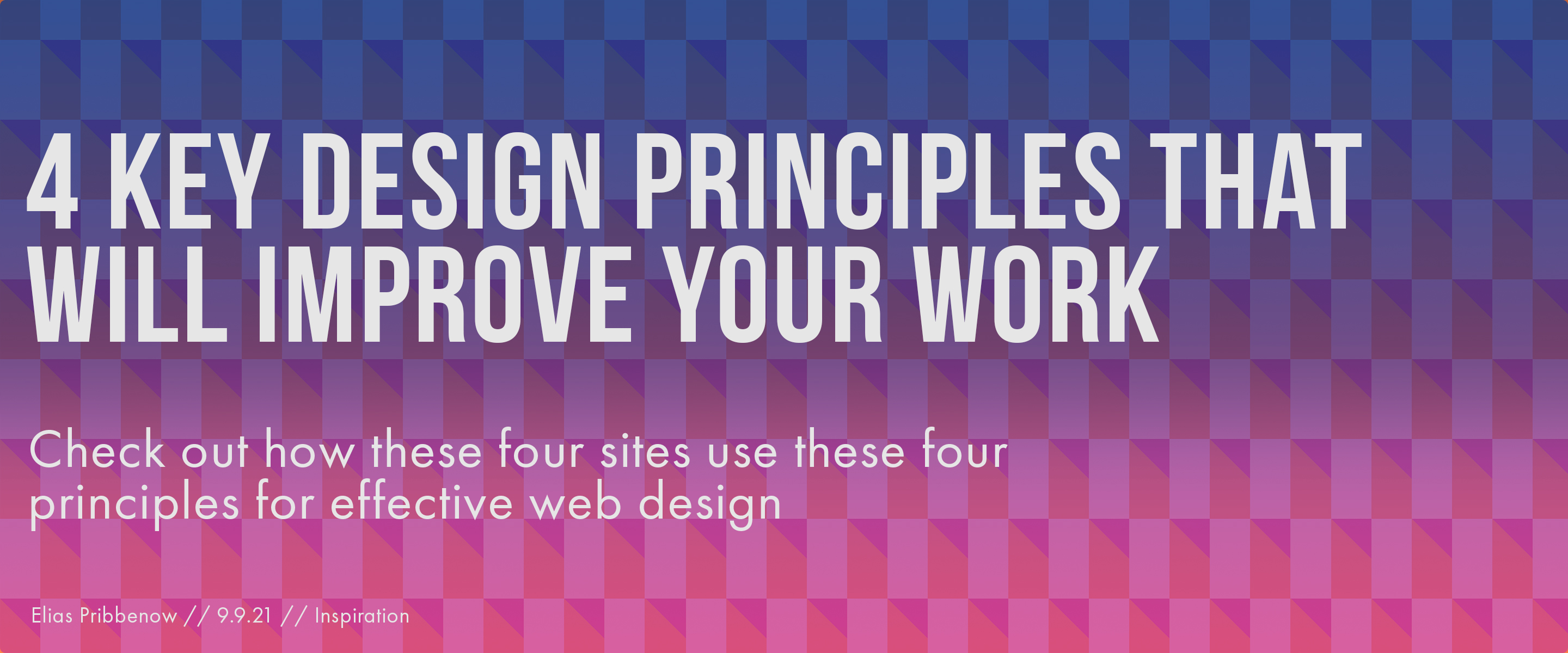

I chose pattern as one of my 4 design principles. One website that has a lot of patterns is weareorm.com. The pattern in the background drew my eyes to follow it down and made me want to scroll down through the page. Pattern Example
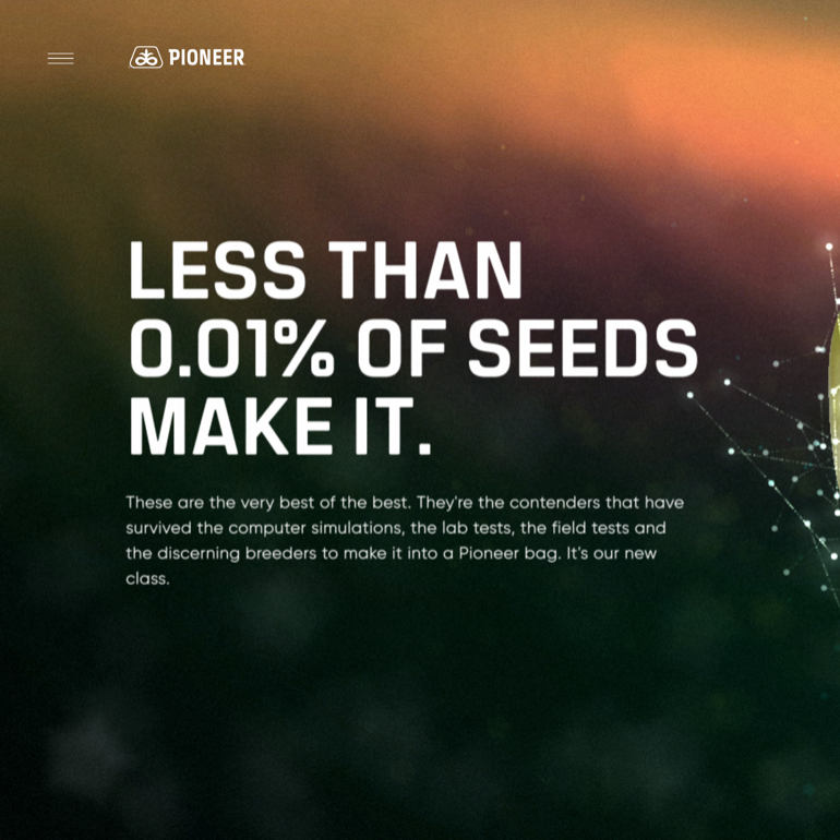
My other design principle I chose was proportion. The website go.pioneer.com uses proportion well in its text between the title and subtitles. I chose to use the same kind of proportions on my hero image design. Proportion Example
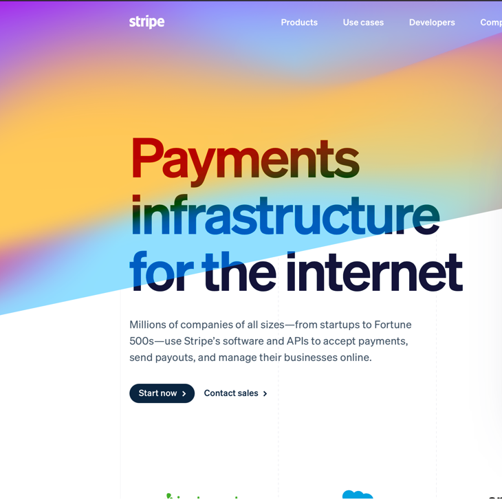
I also chose to use the principle of gradation in my hero image. The website stripe.com uses very colorful gradients on their website. This makes the website feel fun and energetic while not having to put in a lot of effort into other design aspects. Gradation Example

TThe last principle I chose to use was contrast. Apple.com has a lot of contrast between their text and their colors and their images. I chose to use contrast with my text with a capitalized sharp bold font for the title and a softer, thin font for the subtitle. Contrast Example