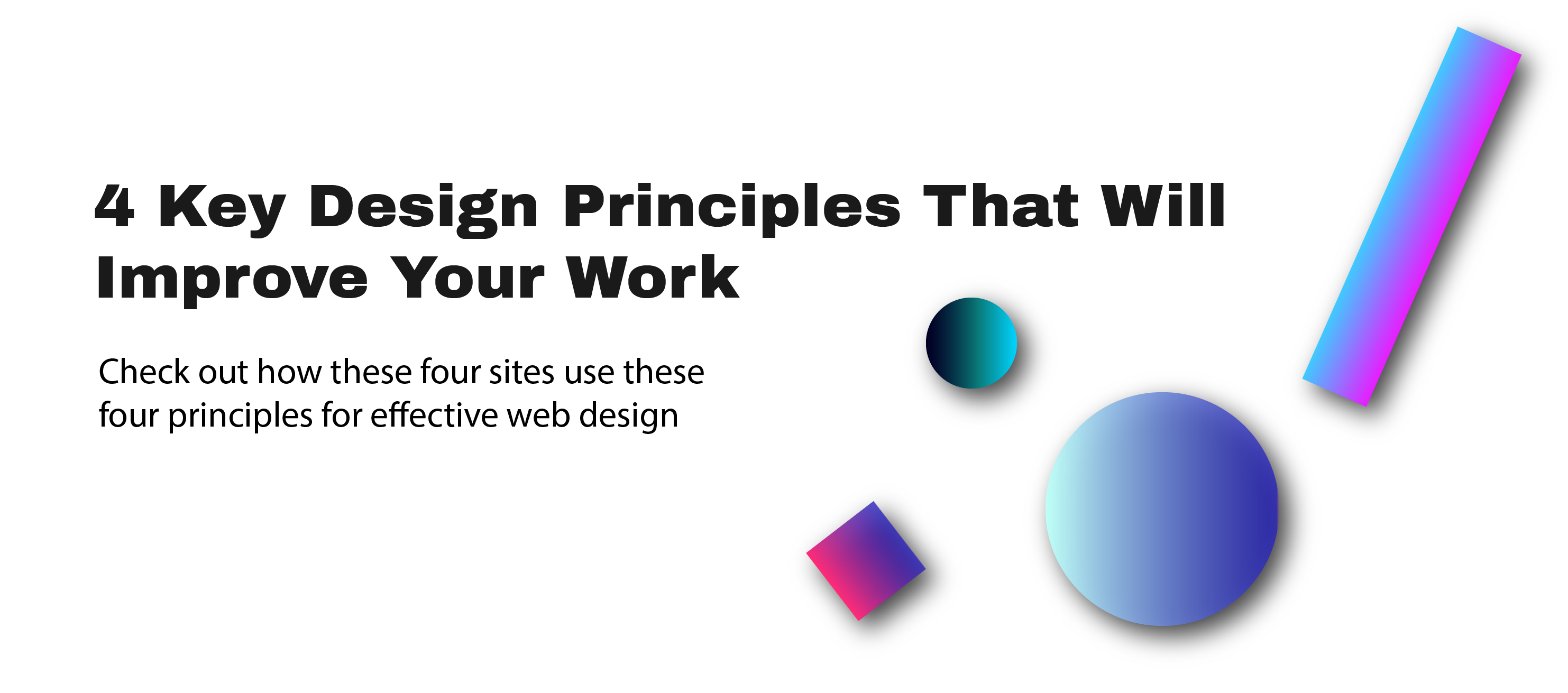
this website has a very simple and modern take on web design. It does a good job keeping the focus of the viewer without being overwhelming s very simple and modern. It keeps the viewers eyes always looking at the main topic. It is very simple and easy to go through. The animations create some sort of curiosity. The use of solid colors helps keep it intriguing. timeframe
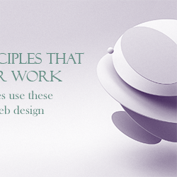
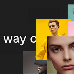
This is one of the variants for my hero image its very simple and monochromatic at the same time bold I would say. I tried implementing all 4 principles in this hero image. Emphasis on the text, movement of the image on the right it looks like its hovering, simple I went with a simple gradient. Sublink
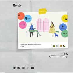
This website feels like going through a sketch book. This interaction starts off from the home page you get to open the book. As you click it unfolds to whichever direction your mouse is moving. This movement and interaction make viewing a website more interesting. netrix
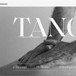
This website has a monochromatic them. It advertises what it does through animation and videos. The very settle changes from one slide/ page. It fuses a lot of videos and animations on the text it emphasizes on what they are doing instead of trying to oversell themselves. Tangan